When the Chinese speak of ugliness, the term for it (难看
) literally means “difficult to look (at)”. Our eyes decide our focus of attention and therefore our thoughts and our cognitive load. As a biological remnant from prehistory, they are not just guided by our intelligent thoughts and ideas, but by our base survival instincts; by threats; by movements; and by bright colours. There are cliché anecdotes about beauty requiring symmetry or colour contrast, but these are just two of many ways of facilitating the guidance of the eye. Symmetry is beautiful because it accelerates our analysis of our surroundings. In this article, we shall explore the more nuanced ways of how the eye is guided and we shall even see examples of where beauty exists despite a lack of symmetry.
Readers may be familiar with the idea of the
sensory homunculus − a distorted drawing of a person where the body parts are sized in proportion to their sensory receptiveness. A cartoon character is in the same vein as the homunculus − it is a drawing where the human form is sized in a way where body parts are proportional to a
viewer's sensitivity to them. Let's use Titeuf as an example.
We can see here that viewers must be focusing on the nose, the mouth and especially the eyes. Look at the massive gap between Titeuf's eyes and his eyebrows. Extra entropy outside these regions would be a distraction, but inside these areas, they aren't so bad and can even be beneficial. We can see this effect with Cindy Crawford and Dita Von Teese. Moles are generally hated, but these two women still look good despite the moles, since they occur in areas where viewers are already looking. Fun fact: Dita's is actually a tattoo.
 |
 |
Consider as well these images, before I explain the point:
The mutations here aren't as noticeable as the bad teeth, as indeed was hypothethised in the cartoon images. We begin to feel
ugliness because our eye keeps being drawn back to the teeth even when our eyes want to wander around the face, appreciating all aspects. Notice too that when we're looking around at the image, we don't just see the mutated face, we also see other people, which leads us to the next important point.
Scale
When our eyes glance around an image, we see at three different scales: the bust; the body; and the mob. Do you remember for instance if Dita Von Teese was wearing a bra or a dress? Our eyes stop paying attention by that point and hence it makes sense that she cuts off her portrait there. In proving the theory of the first scale, I can't cite cartoons, but I can cite the prominence of the bust statue as proof that this is how the face is regarded. It could've just been a head or it could've been half a body. In justifying the mob as another scale, we can simply look to the consistency of cartoons: all the characters are drawn in the same style. We can see the same effect in the Colgate commercials: all of them feature bland, white Americans, rather than the bad-teeth bloke matched with eg a black drag queen, because that would be distracting.
In thinking about the mob scale, we can also consider group photos − they're often arranged as a height pyramid, with the tallest people in the rear middle. The
mob scale also explains the
cheerleader effect; that someone can look better when pictured in a group of similar people.

|
| Beneficiaries of the cheerleader effect? |
"Do you want the truth or something beautiful? I am happy to deceive you" − Paloma Faith
Colour
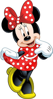
Notice that in any cartoon, the fashions are very conservative and that the colour of clothes always fits with the palette of the cartoon; it is very rare for a character to wear a unique colour.
Colours are therefore not just expressive of a persona, but a culture. Before we get to that; one other point about cartoon colour is the contrast. People often talk about how colours are meant to contrast, by using colour wheels or by checking the HSV coordinates, but be aware that these tools are lies. The scale of computer colours is typically not perceptually uniform. Brown should be a narrow region for instance and blue should be a huge region. To see the proper range of each colour, consult a rainbow.
Another complication of colour perception is language. Just as with wine-tasting, having a bigger vocabulary for colours allows specific colours to be perceived more readily and remembered more easily, even if not done consciously. One may also notice that even though a translator might tell you for instance that "rouge" means "red", these concepts might in fact refer to different wavelenghts of light. Asians favour a more crimson red than Western red for instance and I would argue that the concept “赤” is therefore different to “red”.
The concept of vocabulary in fashion doesn't just apply to colour, but also to text on shirts. The trend of Asians wearing nonsensical English was possible because fashion is about expressing identity, not actually spreading any ideas, so it's not as though anyone was actually meant to read the words being said.
One final problem affecting the choice of colours is that human eyes perceive some colours more easily than others. Chartreuse yellow is seen most readily and this is the main reason why it's used for "safety" contexts. Chartreuse yellow is visually offensive. It is the visual equivalent of shouting at passers-by. Society accepts that sound can be offensive and, as discussed in another article,
A Good Citizen is Ignorant of the Law, this causes the mob to make it illegal in such contexts as disturbing neighbours who were too old and cynical to be invited to the party. Unfortunately though, the understanding of sight is not sufficiently widespread, so governments are unable to create fashion police.
 |
| How are we supposed to see the stock when we're distracted by your vest? Source |
Visual distractions increase
cognitive load and contribute to
rendering city residents stupid. The ugly vests do not suit the rest of the outfit and hence it becomes harder to distinguish that it's being worn by a person. The net effect on the worksite is that workers become stupid and they see their workmates as distracting blobs, rather than as people. No wonder they see female passers-by as objects too.
The effective use of colour is to create a visually comprehensible palette. It helps the eye move around the whole scene at the three different scales without being jerked around by distractions akin to someone shouting "hey, look over there!" Black-and-white photographs can be appealing in that they help to keep the palette consistent and suppress distraction. The eye is permitted to wander and appreciate the details, rather than being jerked away.
 |
| Effective use of a palette. Source |
Discrimination
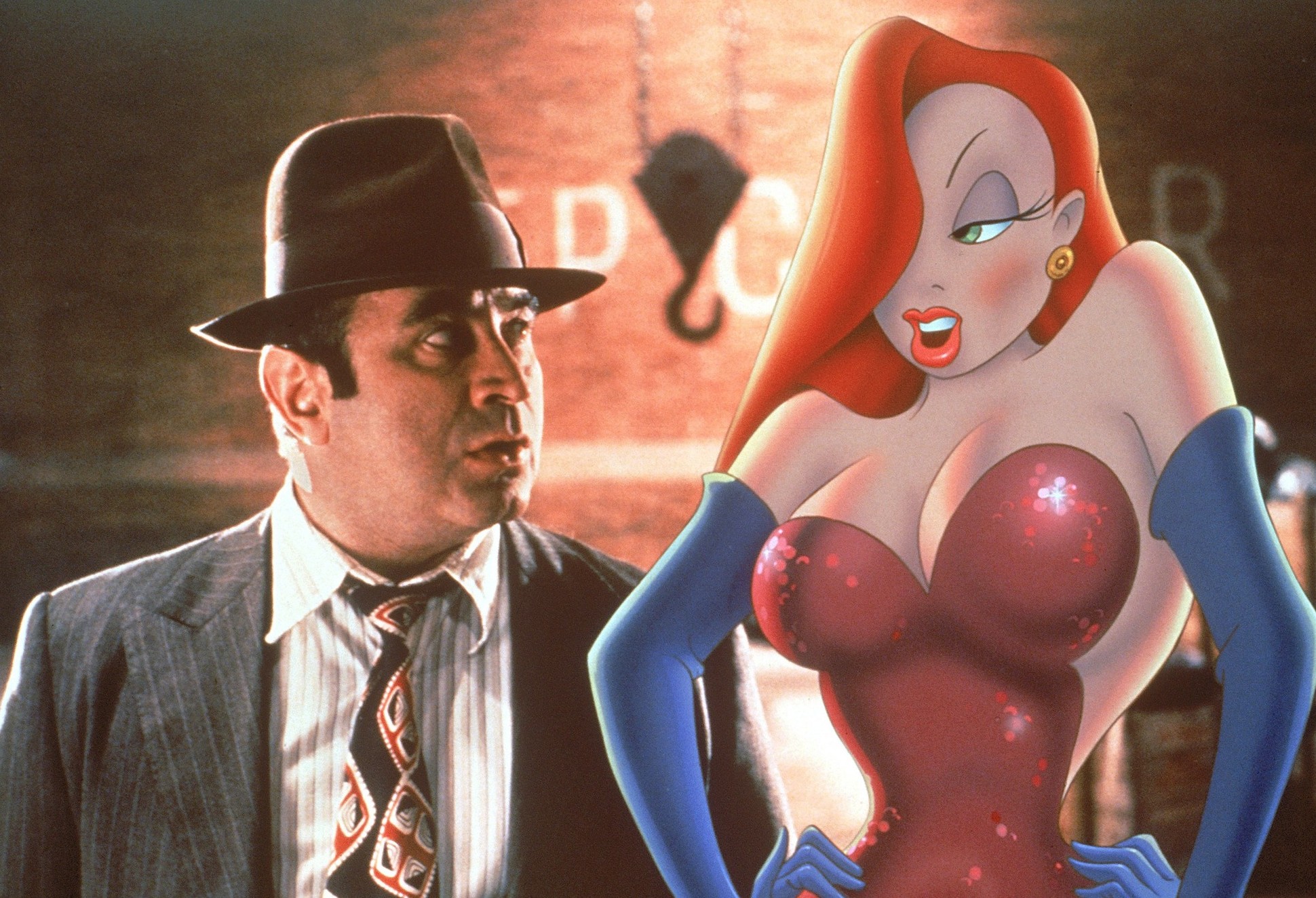
Besides teaching us about fashion and beauty, films such as
Who Framed Roger Rabbit and
Beauty and the Beast also touch on the important topic of discrimination. Western society goes too far in its praise for beauty, to the point that ugly people, especially women, are regarded as less human. This discrimination is subconsciously encouraged by misappropriating "beautiful" to non-visual or irrelevant contexts. Saying for instance that someone's good deed makes them a "beautiful person"; or saying that a "beautiful 8-year-old girl is missing" encourages the idea that their beauty is some kind of symbol of their innocence or perhaps their status as a human. Villains in film are typically ugly, as it plays on the discriminatory tendency to believe that ugliness and malice are inherently linked.
Beauty-based discrimination is rarely addressed, but one such instance was the fuss about Facebook's "feeling fat" emoji. It was framed that Facebook was the guilty party here, but I would argue that the offended people were the guilty party, as they're the ones who made the leap from "fat" to "sub-human". In some cultures, being fat is acceptable or even desirable.
I didn't bother making the distinction between "beauty" and "fashion", as thanks to plastic surgery and hair dye, the two terms have now become more interchangeable. In pondering the future of beauty discrimination,
Tyra Banks also backs me up with this questionable optimism: "Because beauty will be so readily accessible, and skin color and features will be similar, prejudices based on physical features will be nearly eradicated. Prejudice will be socioeconomically based.”


